
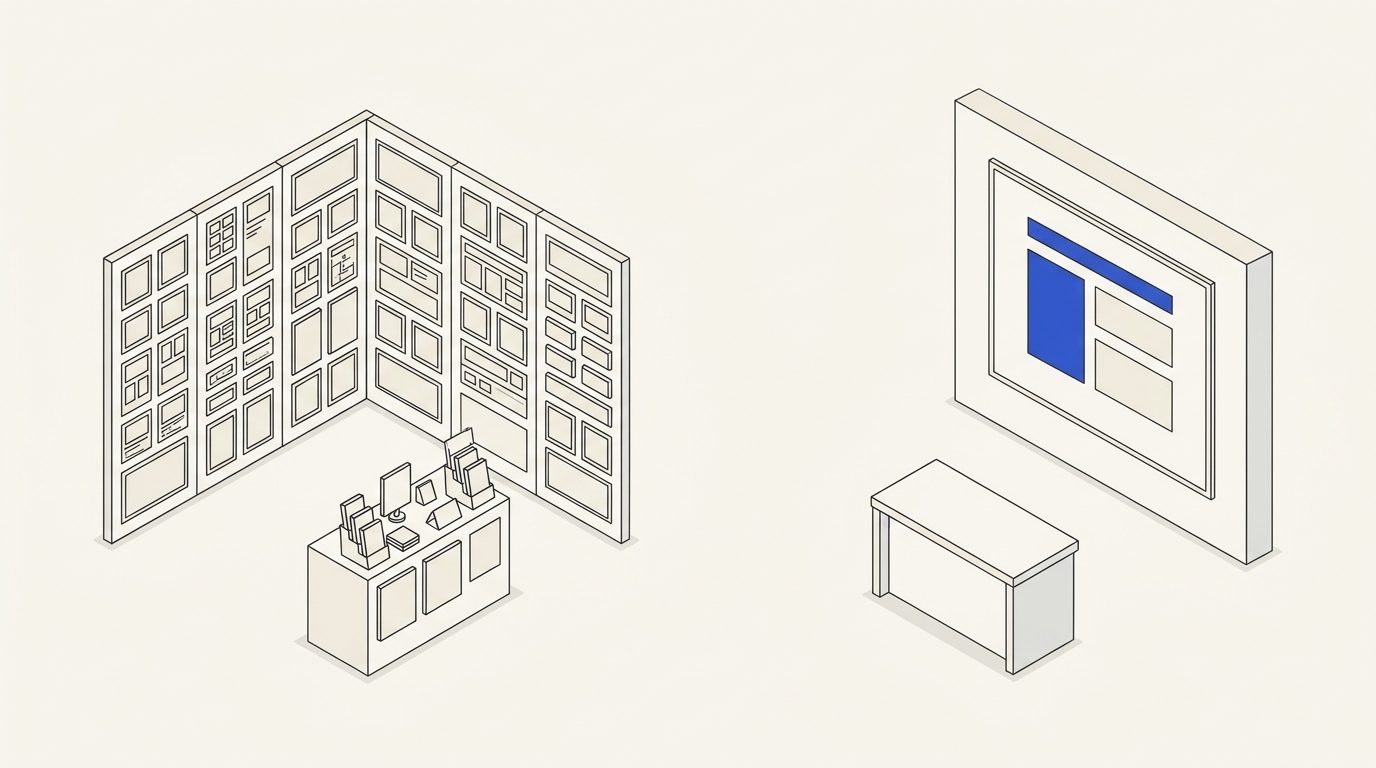
An exhibition stand can be expensive and visually elaborate while leaving visitors unable to tell what a company sells. People passing by see a few objects and have little time to read paragraphs. Effective graphic design must establish a viewing sequence: who you are, what problem you solve, how the offer is supported and what an interested visitor should do next.
Start with one understandable statement
Ask sales staff for the priority of this particular event, rather than a list of all capabilities. From the aisle, should visitors identify equipment, a service, an industry, a region served or a complete solution? “Innovating the future” answers none of these. A concrete product description may be less dramatic but more valuable.
Separate messages by viewing distance
From the aisle, the main proposition and a recognisable visual should work immediately. From a moderate distance, visitors can see two or three benefits or applications. Up close, they can read details, specifications and contact information. There is no universal font-size table: venue dimensions, lighting, materials and foot traffic all matter. Test at real scale.
Branded visual design supports recognition without filling the wall with repeated logos. Choose product imagery and process diagrams for their explanatory value. If a product is hard to photograph, a precise functional diagram may be more informative than decorative abstract art.
Include physical limitations
Confirm booth dimensions, visitor entrance, neighbouring stands, hanging heights, power supply, lighting, print materials, storage and assembly conditions. Do not place essential copy behind a brochure rack or monitor. Check contrast in likely event lighting and test QR scanning at its actual material, distance and mounting height.
Hypothetical TASK-088: simplify an overloaded stand
A 3 × 2 m fictional booth contains 11 slogans, five icons and two unrelated photographs, while the company actually sells industrial equipment maintenance. The team chooses one large maintenance headline, three verifiable service items—“diagnostics”, “repairs”, “scheduled servicing”—and a clear invitation to speak with the exhibitor.
- Inventory all 11 original statements and mark which actually distinguish the service.
- Keep one main proposition and three supporting elements instead of competing equal-weight slogans.
- Place important copy above physical obstructions, and choose a photograph that shows recognisable equipment.
- Print a full-scale sample and check legibility from 2 m and 5 m.
- Ask a participant unfamiliar with the company to state what the stand offers after five seconds.
Positive test: the participant correctly names the service, finds the contact point and no essential text is obstructed. Negative test: only abstract slogans are visible, a QR code cannot be scanned or the technical claim is hidden behind a screen.
Commissioning and acceptance
For an estimate provide a floor plan, venue photos, construction drawings, source brand artwork, product list, event languages and organiser requirements. Deliverables may include an information hierarchy, dimensioned artwork, production files, previews and a supplier verification checklist. Design support may cover later adaptations, while manufacturing and installation must be agreed separately. Request a tailored scope through contacts.
Three reading distances, not one densely packed poster
For fictional booth EX-88 measuring 3 × 2 m, a visitor first walks by, then pauses, then speaks to a representative. Level one is a brief, clear proposition legible in passing. Level two names the actual service or product category. Level three provides details and a contact route. These levels do not override any mandatory regulatory wording applicable to a particular product or event.
- From the aisle: one substantial headline with a concrete result rather than twelve competing service labels.
- Several steps away: three concise blocks showing the audience and offering.
- At the counter: QR code, contact, product sample and explanatory materials for a conversation.
Do not define legibility using font size alone. Actual distance, viewing angle, lighting, contrast, adjacent booths and substrate affect the result. Test a full-size section before production. On the floor plan, mark visitor entrance, obstructions, mounting points, neighbouring structures and QR access.
Rehearse EX-88 with unfamiliar observers
Three people who do not know the proposed message walk past the mockup from the planned distance. Ask each to name the service within a few seconds, then check whether they notice the secondary content and know where to request details. If they identify only a logo and small text, redesign the proposition. On a second test, inspect a full-sized material section and QR code at the real height.
Attach the stand plan, builder specifications, brand files and production restrictions to the brief. The published identity offer illustrates branded materials, but a custom exhibition graphics project with production control is independently scoped and not automatically included.