
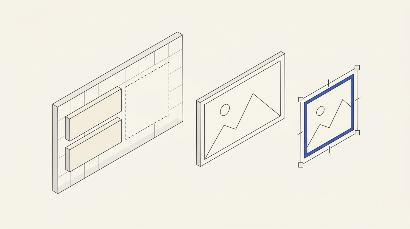
After a product photo is replaced in an advertising banner, the composition may suddenly stop working: the headline covers a face, packaging gets cropped, and the CTA blends into the background. That does not necessarily mean the new photo is defective. A layout designed for one picture may be too fragile for ongoing content changes. Repeatable creative production needs rules for replaceable elements and tests with different image types.
Separate fixed and variable elements
Lock down the brand elements: logo, typography, grid, approved colours, CTA dimensions and clear space. List the variables separately: photos, headline length, price, campaign date, language and placement format. Do not promise one universal template. A packshot against white and a detailed room scene may need different compositions.
A visual identity system can establish the underlying rules, while hourly creative adaptation may support frequent updates. Neither replaces reviewing each actual advertisement when its visuals or commercial conditions change. The RU source also discusses AI background extension and perspective; no corresponding published EN specialist article is assumed here.
Define safe areas for each placement
For every output size, identify where the product, essential claim and CTA must remain visible. A desktop image cannot simply be scaled or centre-cropped for mobile. An alternative mobile crop or a separate photograph may be better. For portraits, check facial visibility, gaze direction and image-use permission.
Test components with headings close to their real maximum length, not just the shortest slogan. Specify allowed lines, how long product names behave and which parts of the photograph must never be covered by text or buttons.
Build a repeatable replacement workflow
Use structured design templates with stable layers and a clearly named image container. Replace its source, then inspect crop, focal point, text contrast and safe boundaries. Automated cropping cannot always recognise the important subject. For employee-facing templates, protect brand layers and document the export settings in a short guide.
Worked hypothetical TASK-085: four exports
There is a 1200 × 628 px horizontal banner and a 600 × 750 px mobile version. The first product photograph has a 4:3 aspect ratio and the second 3:2. Text is on the left, product on the right. When the second image replaces the first, some packaging falls beyond the edge.
- Keep both original photographs and both output dimensions as a four-case test matrix.
- Define a product safe zone containing the entire recognisable item and a text region free of critical photographic details.
- Configure permissible crops independently for each format; on mobile, move the product beneath the headline where necessary.
- Insert both photographs, verify CTA contrast and legibility, export all combinations and view at their actual on-screen dimensions.
Positive test: all four exported banners show the recognisable product and clear action without clipping required elements. Negative test: an automatic central crop cuts the top of the package or text becomes unreadable. Change the crop or choose another composition.
What to supply for a quotation
Provide editable design files, two or three actual photography sets, placement sizes, languages, brand guidelines and examples of routine replacements. Deliverables may include masters, approved compositions, export presets and a staff guide. Send materials through agency contacts for a bespoke estimate based on formats and difficult cases; do not treat an unexamined creative workload as a fixed package.
Make safe areas explicit, not a blanket guarantee
Suppose campaign B-85 uses a 1200 × 628 horizontal and 1080 × 1350 vertical banner. Partner photos change monthly. First mark headline, CTA and obligatory details; assign the remaining photo area only after considering the crop in each placement. Stretching one grid across different ratios without checking it can move a face or product beyond the visible canvas.
- Photo 1: subject at right, space for text at left; test both formats.
- Photo 2: centred subject; use another mask or a dedicated vertical crop so copy does not cover the focal point.
- Photo 3: insufficient source resolution; request replacement rather than concealing the defect with artificial enlargement.
The package includes a clean editable template, agreed fonts, masks, logo placement rules, colour styles, sample exports and instructions. On every replacement, check licensing, unacceptable product distortion, CTA visibility and placement-specific requirements.
Acceptance test for TASK-085
An employee uninvolved in the design gets a hypothetical 15-minute test to replace three photographs and export both sizes, producing six files. That duration is a criterion for this fictional exercise, not an agency service guarantee. Success means six readable assets with complete subjects, stable fonts and no overflowing text. Failure means the heading covers a face in the centred portrait or the vertical crop loses the product. Revise the masks and acceptable source requirements rather than declaring the template universal. The general identity offer does not automatically include banner adaptations; agree their count and scope separately.
For the initial campaign asset, the banner design service describes deliverables and formats, but a reusable template with independently replaceable photographs needs a separate brief.
For multiple web and paid-ad placements, the digital and offline creative design service is relevant to export specifications. It is not proof that every future crop works without human inspection.